
corporate identity and website design for coffee roaster
concept
year
2026
softwear
Figma
Tilda
Adobe Illustrator
Tilda
Adobe Illustrator
BRAND DESIGN
«СФЕРА кофе»
«СФЕРА кофе»
BRAND
DESIGN
«СФЕРА кофе»
DESIGN
«СФЕРА кофе»
PROJECT WORKING PROCESS
2026
studying the target audience
brand analysis
corporate identity development
user flow
pre-press preparation
packaging design
UX & UI design
designing with Tilda
market analysis
may
jun
aug
jul

AIMS AND OBJECTIVES
and problems
aims
develop a brand identity, packaging,
and a responsive website for a
specialty coffee roaster.
and a responsive website for a
specialty coffee roaster.
problems
develop a modern brand identity that follows current design trends yet stands out from the competition
objectives
analysis of the market, competitors, references, and analogues
development of brand identity
coffee packaging design
UX & UI design
responsive layout: 1920px, 1440px, 360px
designing with Tilda

TARGET
audience
demographic characteristics
20– 40 years
clients from St. Petersburg, but delivery is available across Russia
average and above-average income
importance for the client
complete information about the beans
diverse flavor range
freshly roasted coffee
customer pain points
the brand's tastes are either too ordinary
or, conversely, exceptionally exotic
or, conversely, exceptionally exotic
there is no indication of which brewing method a specific roast is best suited for
I’d like to explore specialty coffee, but not all roasters provide detailed information
the coffee is not always freshly roasted or of high quality, and the suppliers do not provide detailed information

COMPETITOR
analysis
style of competitors' products
most competitors use minimalism, Swiss design, or avant-garde styles, sometimes combining them
information content of grain packaging
most competitors provide minimal information about the beans on the packaging
distinctive symbols are often used in the packaging design to highlight the characteristics of the beans
CORPORATE
identity
moodboard
the roaster specializes in specialty coffee, offering notes and nuances that can be discovered time and again
the mood board needed to reflect not only the brand’s style and color palette but also its passion for experimenting with coffee flavors and its extensive range of coffee lots
the mood board needed to reflect not only the brand’s style and color palette but also its passion for experimenting with coffee flavors and its extensive range of coffee lots

colors
the colors reflect the bean roast profile and the brewing method: for milk-based drinks, espresso, or filter coffee


PRONTED
materials
packaging stickers
I designed stickers for coffee bags with information about each lot
a clear grid and information segmentation into blocks were chosen for ease of reading
the grid is rendered with fine lines to avoid cluttering the packaging
the grid is rendered with fine lines to avoid cluttering the packaging
size chart
the packaging was designed for two pack sizes: 250 g and 1000 g
system in color
the design brief required reflecting the specific category of each coffee lot (based on origin, roast profile, etc.) through the packaging's style or color
the final decision was to categorize the lots by roast type (espresso, filter, and milk-based)
since the roaster already had colors representing these categories, specific shades were selected to ensure the colors harmonized with one another
the final decision was to categorize the lots by roast type (espresso, filter, and milk-based)
since the roaster already had colors representing these categories, specific shades were selected to ensure the colors harmonized with one another
UI
kit
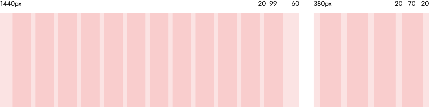
grid
a flexible modular grid has been developed that structures content and maintains a clean rhythm, adaptable to various formats
bento layout
when designing the website interface, the decision was made to adopt the "bento" visual system from the coffee bean packaging to maintain a consistent brand style
photography style
a unified photo-editing style was chosen for the images on the website
convenient search
on the homepage, within the product section, you can click directly on a product card to view that specific item (the five most popular products are displayed) or navigate to the catalog with a filter for roast type already applied
